
Rebrand & Identity System
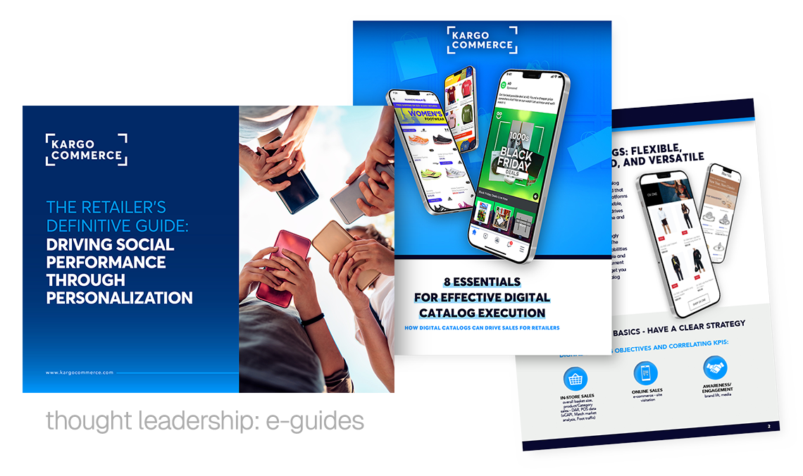
Kargo Commerce
As Director of Brand & Creative, Tony led the rebranding of StitcherAds to Kargo Commerce, aiming to integrate Kargo’s renowned creative excellence with StitcherAds’ performance-driven software capabilities. Tony faced the challenge of balancing the new brand identity with Kargo’s core elements while maintaining a strong focus on usability, measurable impact, and market-leading service. He developed a fresh color palette, a contemporary typeface, and a distinctive visual style for photography that embodied Kargo's mantra of "putting the art in adtech." The messaging emphasized Kargo Commerce’s value as an easy-to-use, high-performance platform for marketers.
Tony also tackled the significant task of revamping a large volume of legacy StitcherAds content to align with the new brand while supporting the needs of a SaaS platform. This involved creating infographics, technical guides, explainer motion graphics, and growth marketing materials that harmonized with Kargo's overall branding strategy. Stakeholders responded enthusiastically to the new identity, supported by comprehensive brand training sessions Tony led. The rebrand successfully boosted Kargo Commerce’s market presence, allowing customers to associate Kargo’s positive brand attributes with the newly established Kargo Commerce.


Rebrand & Identity System
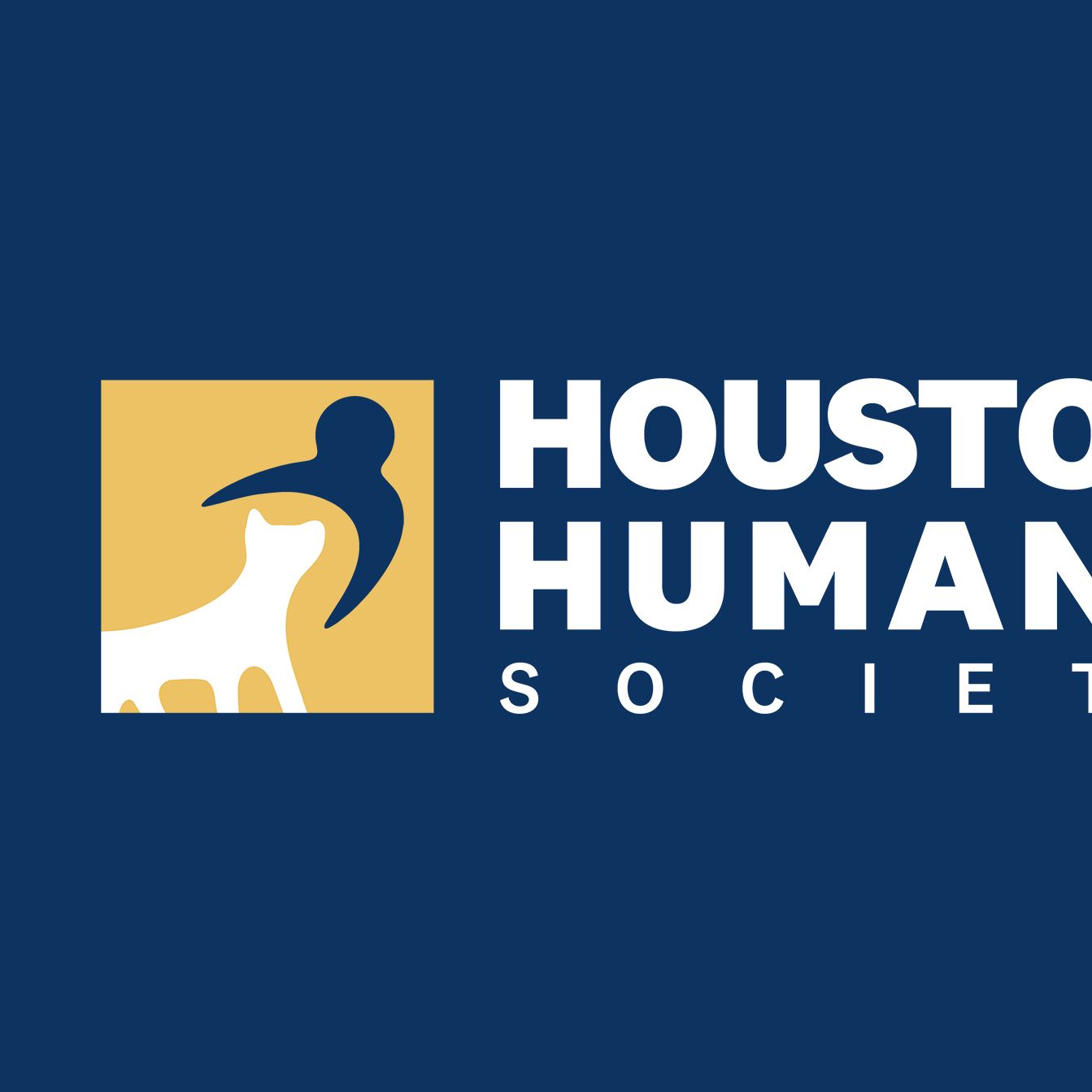
Houston Humane Society
Houston Humane Society required a brand identity that could better reflect the scale, professionalism, and emotional impact of the organization while preserving the compassion at the core of its mission.
The challenge centered on balancing institutional credibility with warmth and accessibility. The new system needed to feel contemporary and trustworthy while remaining flexible enough to support fundraising initiatives, adoption campaigns, advocacy efforts, and community outreach across a wide range of platforms.
Leading the rebrand effort as Creative Director, Tony Moles developed a comprehensive identity system built around an abstract human-and-animal mark designed to represent protection, connection, and care without relying on overly literal or species-specific symbolism. The inclusion of a human figure became a defining strategic decision, reinforcing the relationship between animals, adopters, volunteers, and caregivers.
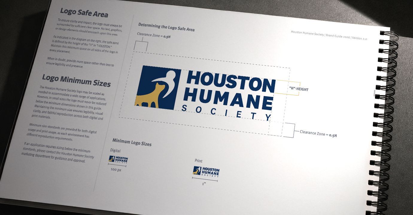
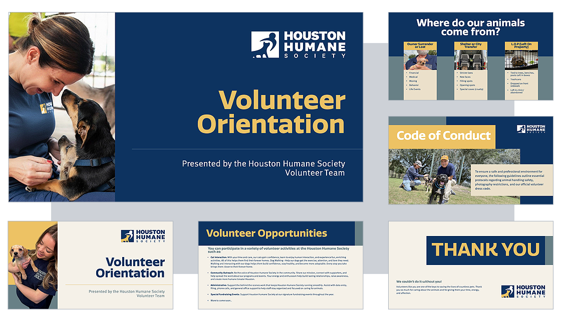
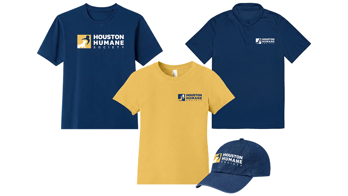
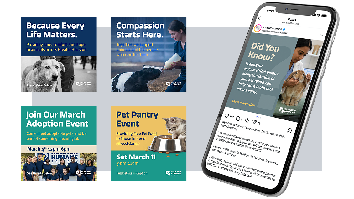
The project expanded beyond logo development into a fully realized brand ecosystem, including typography standards, color architecture, social media systems, environmental applications, and scalable brand guidelines designed to support long-term consistency across internal and external communications.
Scope
- Brand Strategy
- Creative Direction
- Identity Design
- Typography System
- Color Palette Development
- Brand Guidelines
- Social Media System
- Environmental & Signage Concepts
- Presentation & Document Standards
Outcome
The resulting identity positioned Houston Humane Society as a more modern, cohesive, and emotionally resonant organization while equipping internal teams with a scalable brand system capable of supporting future growth across digital, print, and environmental touchpoints.

Brand Development
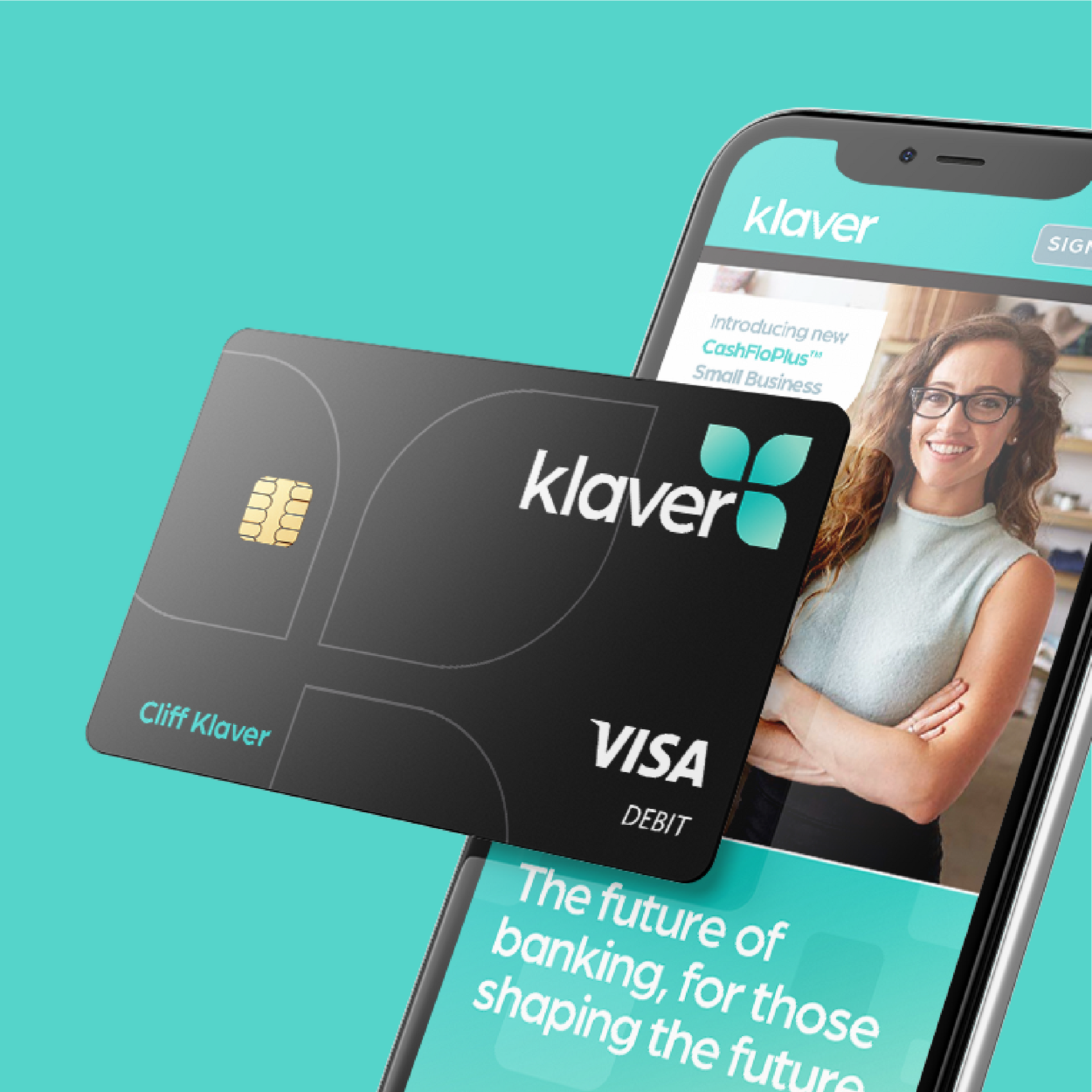
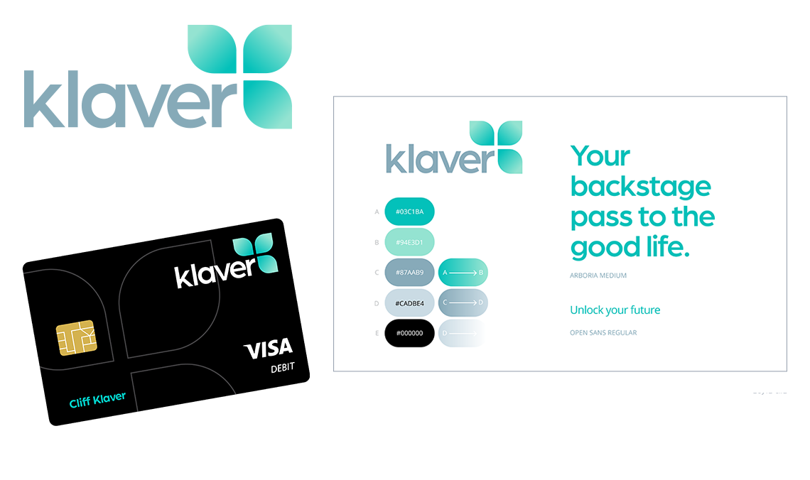
Klaver Bank, US
Klaver, an online-only German bank, was entering the US market and wanted to boost brand awareness among millennials and young professionals. Klaver is the German word for “clover” – this is a bank that will bring you good luck in all of your endeavors. It’s a bank that works to help you invest your money in the right places, to make smart decisions about your savings and to achieve big milestones, such as buying a house.
Tony's strategy focused on an "exclusivity" angle, portraying Klaver as the
“backstage pass to the good life,” appealing to millennials' preference for experiences over material things. He developed the visual identity, using a contrasting palette of neon greens for modern energy and cool-gray for stability, symbolizing Klaver as a vital building block for financial success. The sleek, minimalist design of the all-black debit card, accented with neon green typography and the Klaver logo, reflects maturity, stability, and a distinctive edge that resonates with the target audience's desire to stand out from the crowd.


Co-Branding
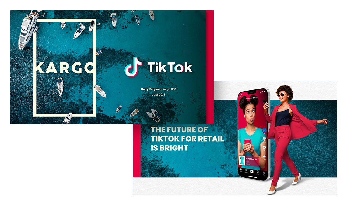
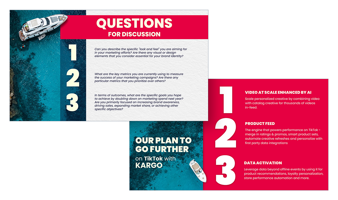
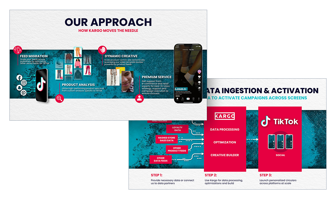
TikTok + Kargo: Cannes Lions
The presentation, delivered to major retail brands at the
Cannes Lions Festival of Creativity, showcased the collaboration between Kargo and TikTok to revolutionize digital advertising for retailers. With evocative seaside imagery reflecting the Cannes setting, it highlights Kargo's use of AI-driven video at scale, product feed integration, and advanced data activation to enhance TikTok’s platform with personalized, dynamic ads. The design was intended to echo the combined cutting-edge ad technology and data-driven solutions of both companies, in order to appeal to worldwide brands in attendance.